Paléo Festival
Visual identity
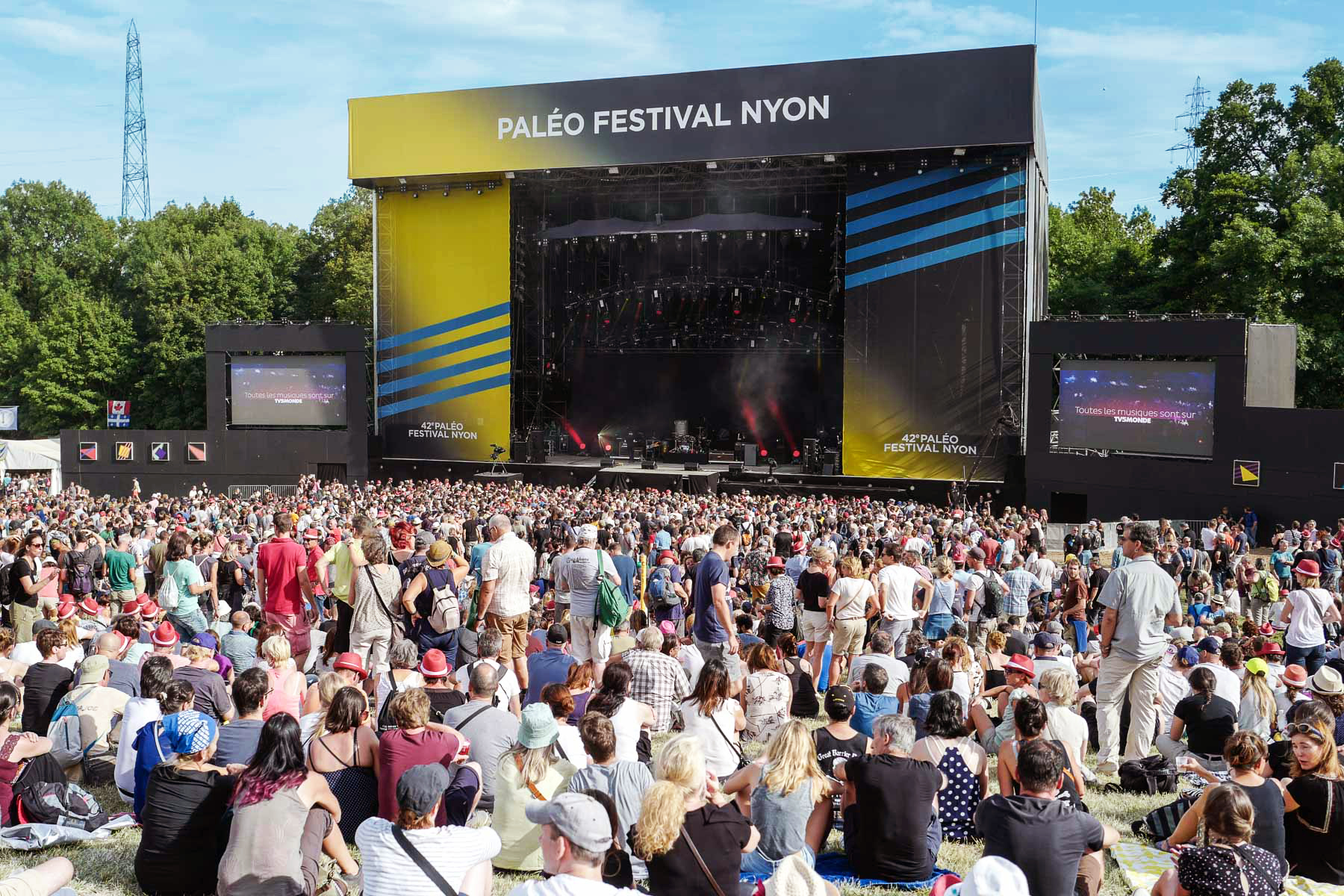
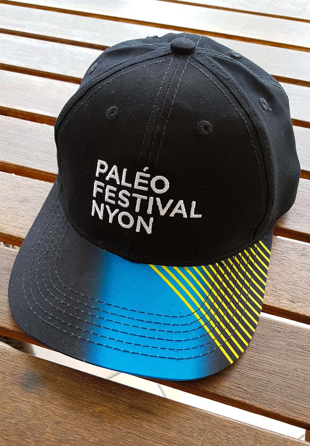
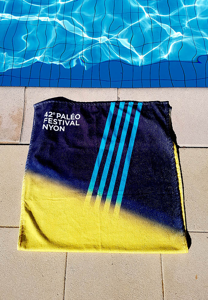
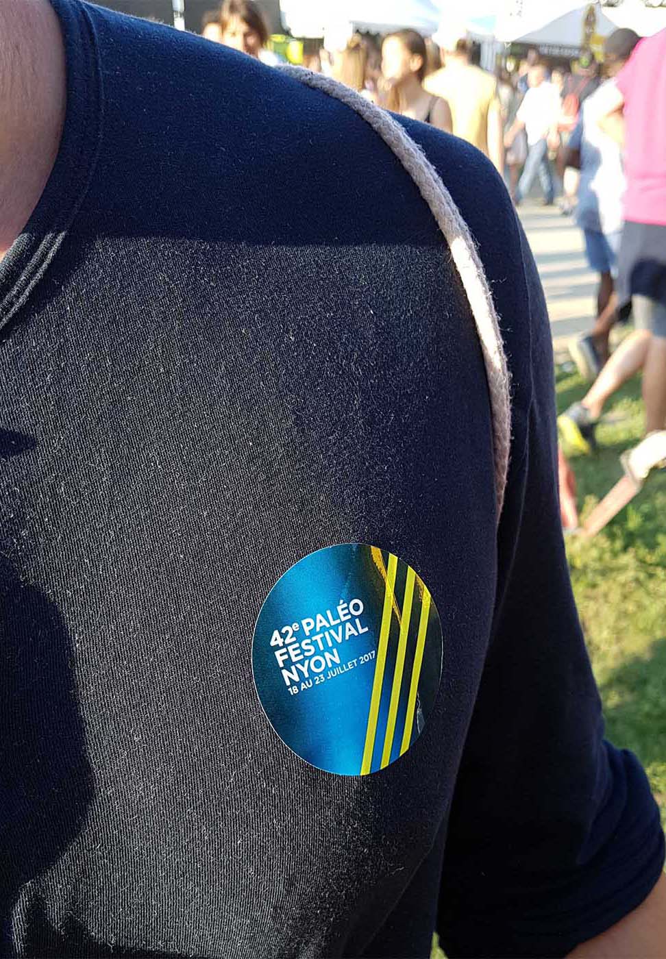
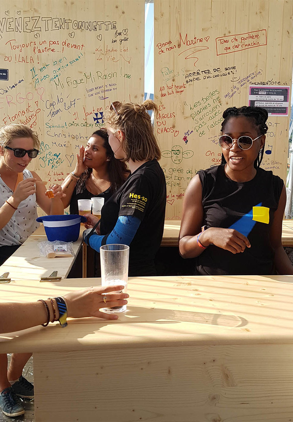
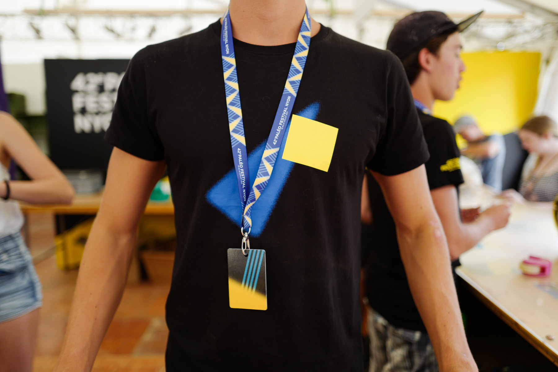
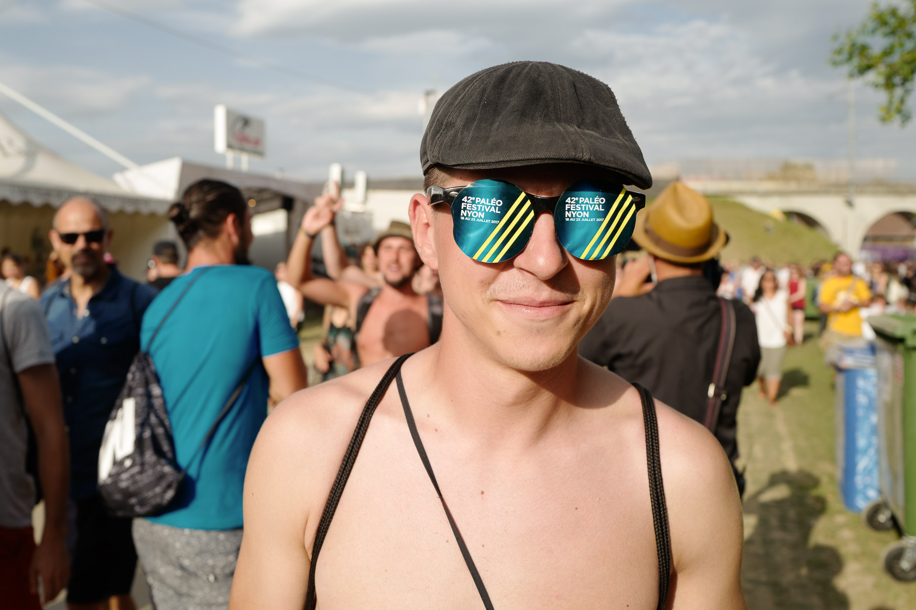
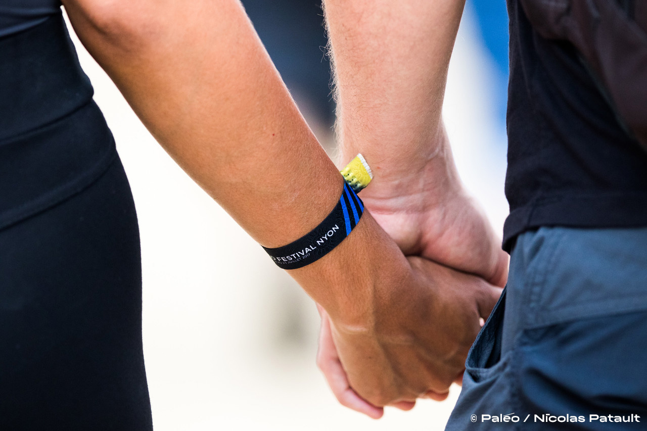
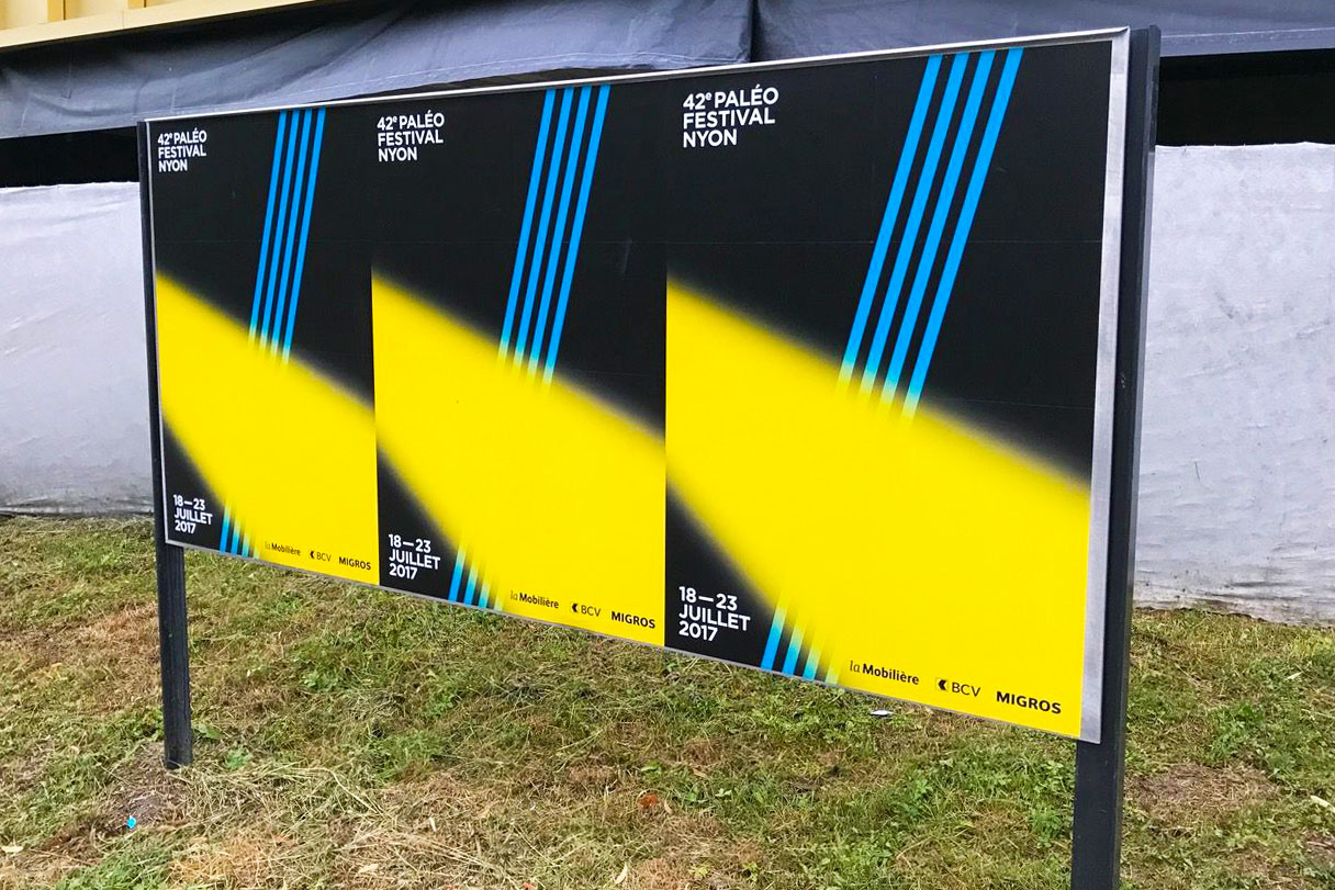
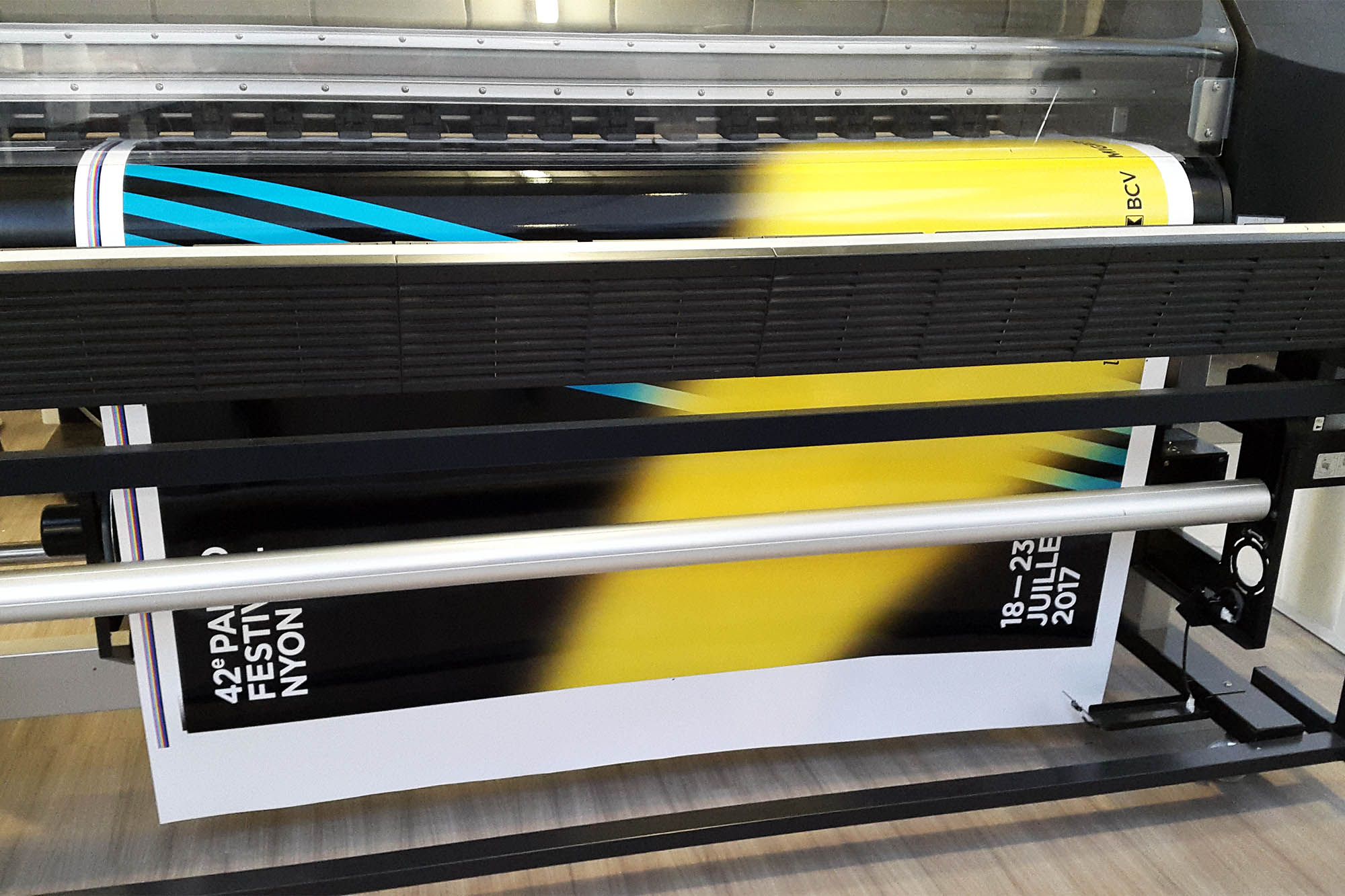
Inspired by the festival’s colors, shapes, and contrasts, the visual identity translates light into graphic form. Geometric shapes, some sharp and some blurred, evoke beams, spotlights, and lighting effects, bringing together concerts, artists, and the audience. These shapes are used to create multiple compositions and variations across all communication materials, including merchandise, resulting in a cohesive and dynamic visual identity.
Font: Gotham
Work with: Catia Ferreira Barreiras